
Panamerican Strategies

Panamerican Strategies
Branding & Deck Design
English below
Panamerican Strategies es un fondo internacional regionalizado en el continente americano. Desde Canadá hasta la Patagonia impulsa iniciativas a través de estrategias de Private Equity, Venture Capital e Impacto.
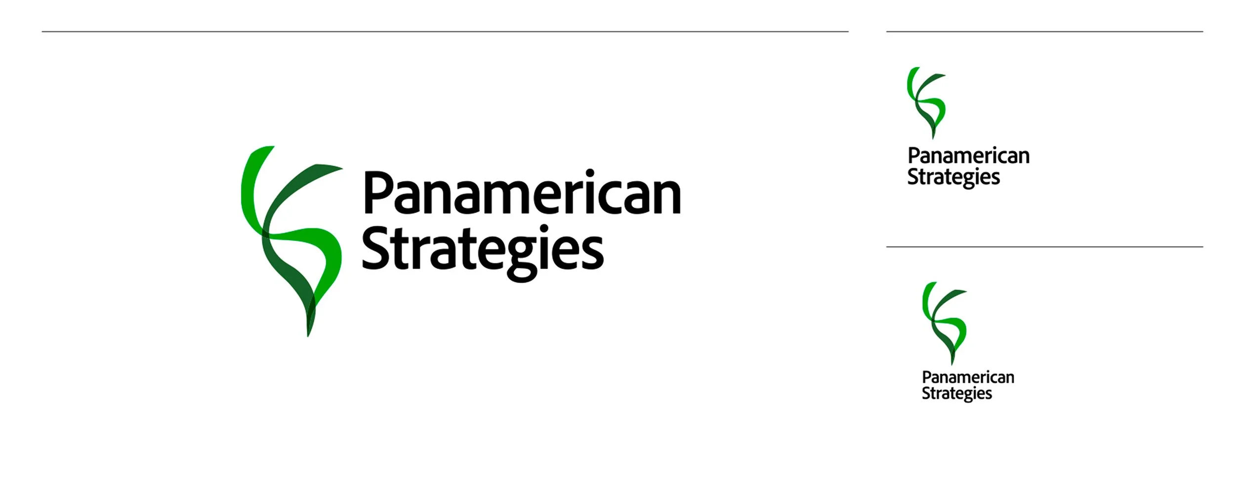
Se propone un logotipo contundente y minimalista. Fácil en su lectura, adaptable en su reproducción y escalable a diferentes tamaños y formatos. El logotipo simboliza al continente Americano, usa dos trazos flexibles para delinear la silueta. Estos trazos son suaves y evocan a la caída de un listón. Cuando se encima el uno con el otro, vemos en color oscuro ese empalme, evocando transparencia. Esta intención de juntar y sumar fuerzas es un guiño a la labor del fondo: tejer oportunidades para engrandecerlas.


Panamerican Strategies is an international fund regionalized in the Americas. From Canada to Patagonia, it promotes initiatives through Private Equity, Venture Capital, and Impact strategies.
A strong and minimalist logo is proposed. Easy to read, adaptable in its reproduction, and scalable to different sizes and formats. The logo symbolizes the American continent, using two flexible lines to outline the silhouette. These lines are smooth and resemble a falling ribbon. When they overlap, we see a dark color at the junction, evoking transparency. This intention to join and combine forces is a nod to the fund's work: weaving opportunities to enlarge them.